Metropolitan Clubtalk #2: the city ofv Nolli en Ottolenghi
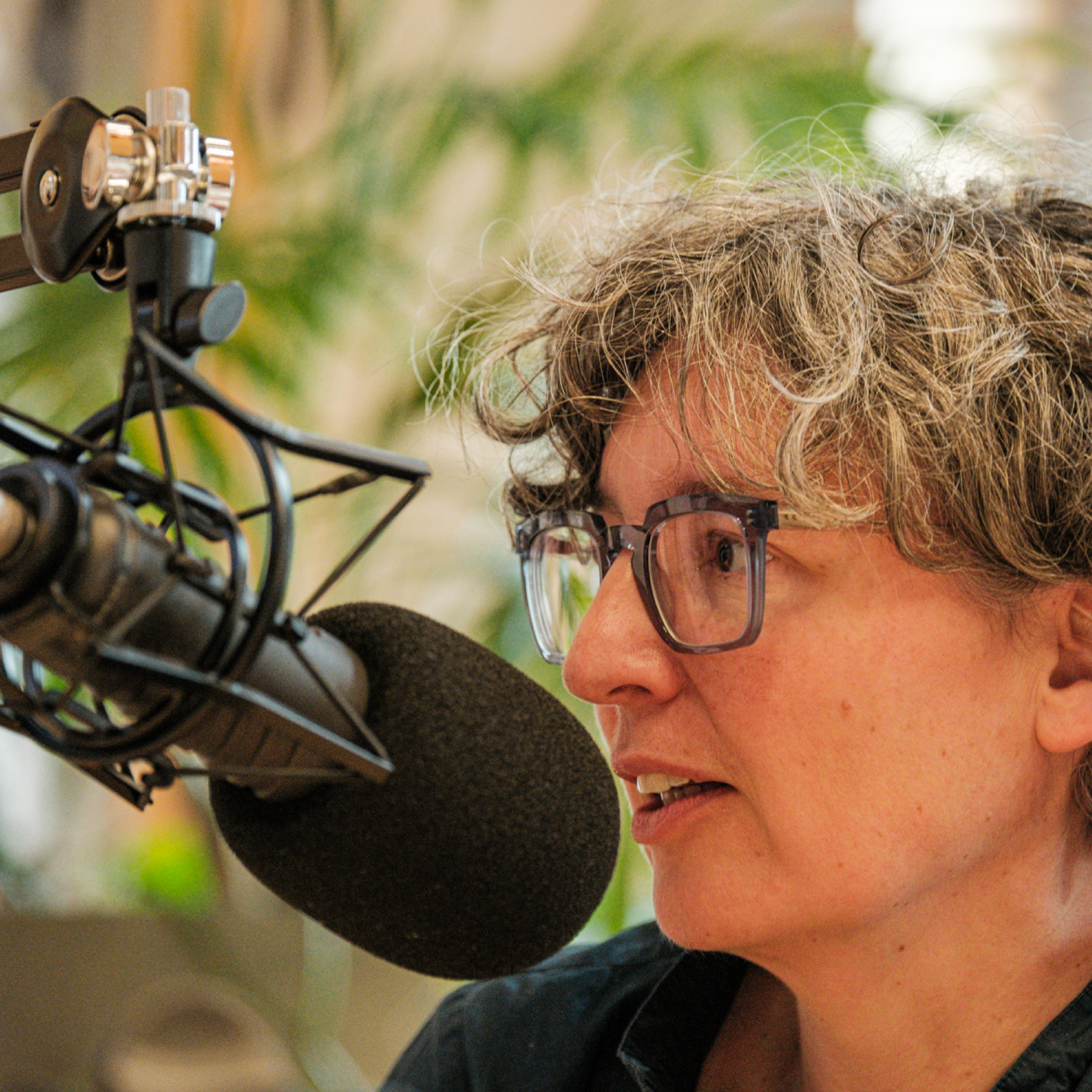
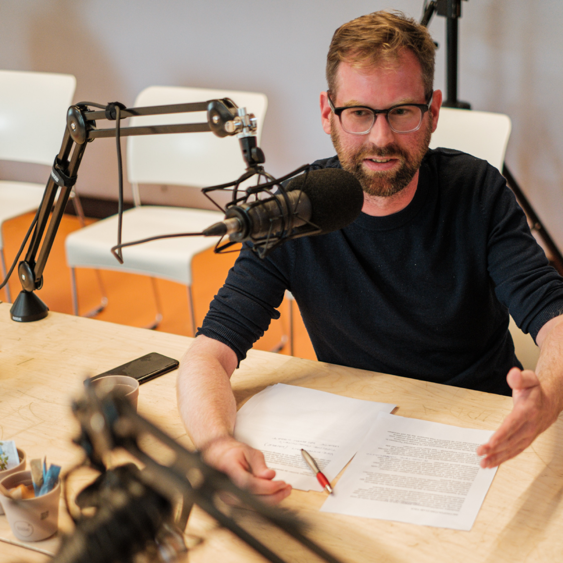
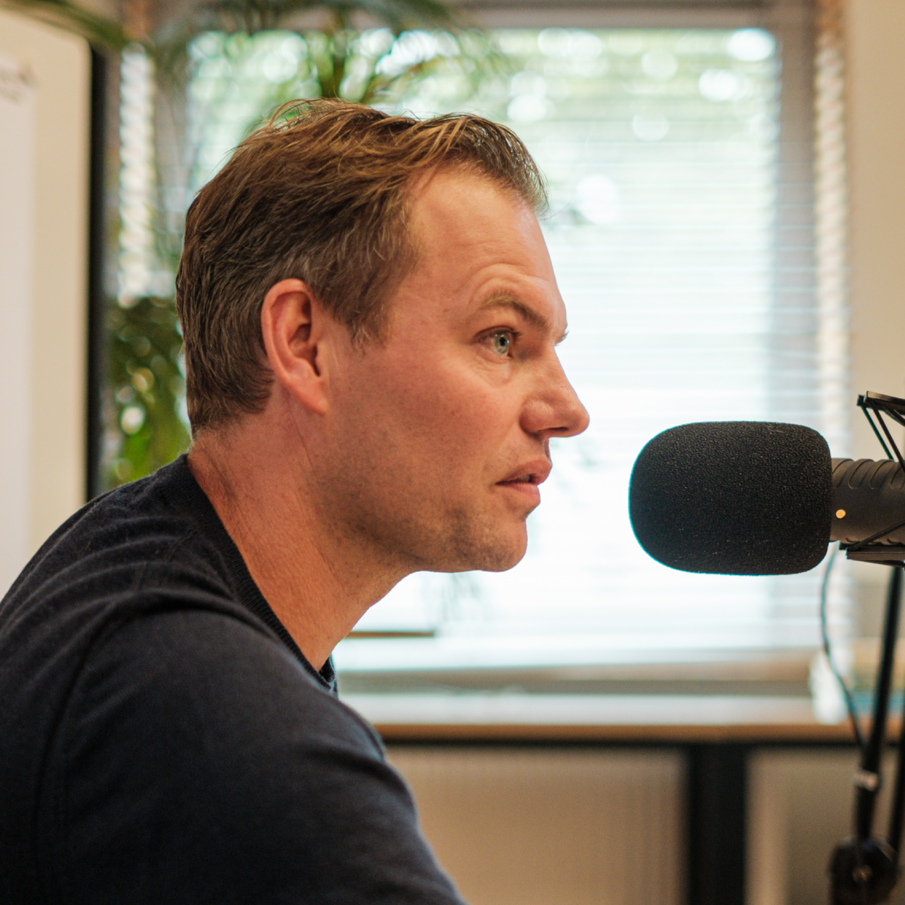
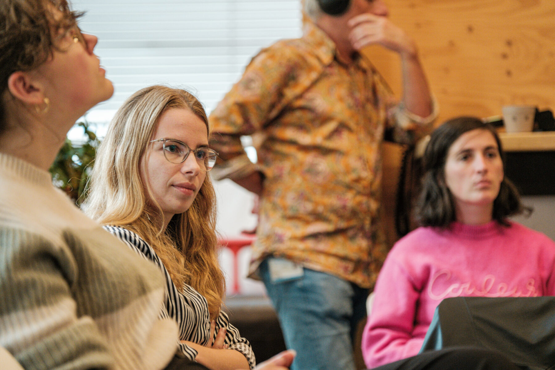
Robbert Jan takes the initiative to engage in an open and in-depth conversation about the concept of the connected city through his role at TU Delft. In the second edition, he is in conversation with Tess Broekmans (Urban, TU Delft), Glenn Lyppens (POLO Labs) and Machiel van Dorst (TU Delft) on the theme "urban issues of today."
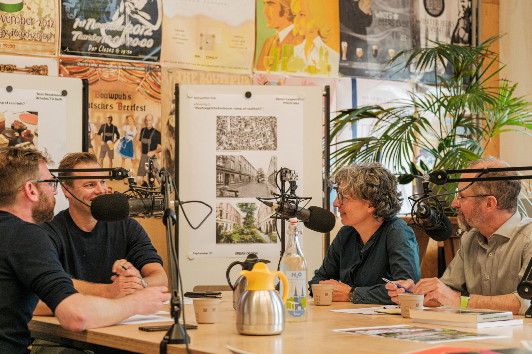
Metropolitan clubtalk
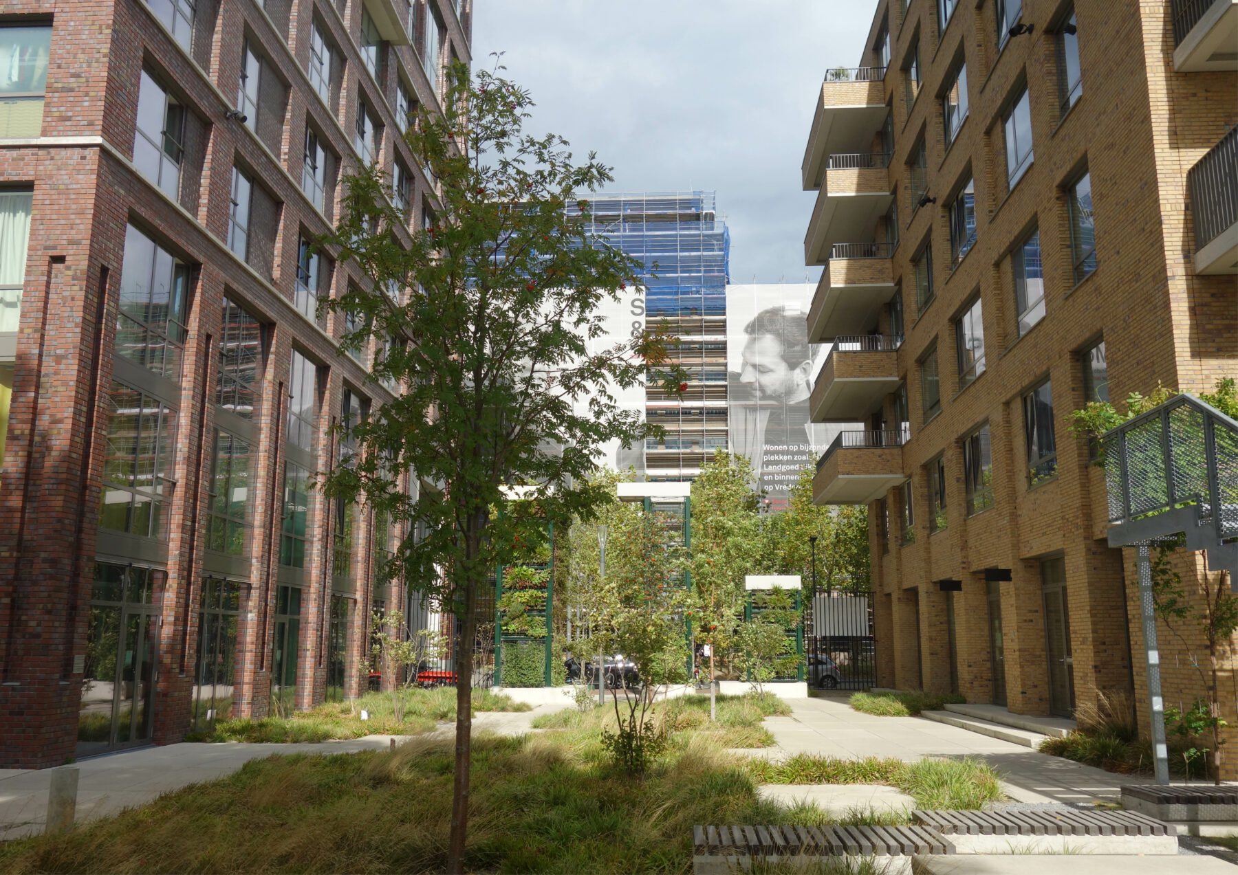
In this episode: the semi-public spaces postage stamp urbanism. In inner-city densification, designer and developer usually have minimal space at their disposal. In a stack of ambitions, it is the semi-public or collective space, often spectacularly designed, that has to make the difference. But how do you design well for communality? And how do these showpieces continue to enrich the city in the distant future?
From Ottolenghi to Nolli
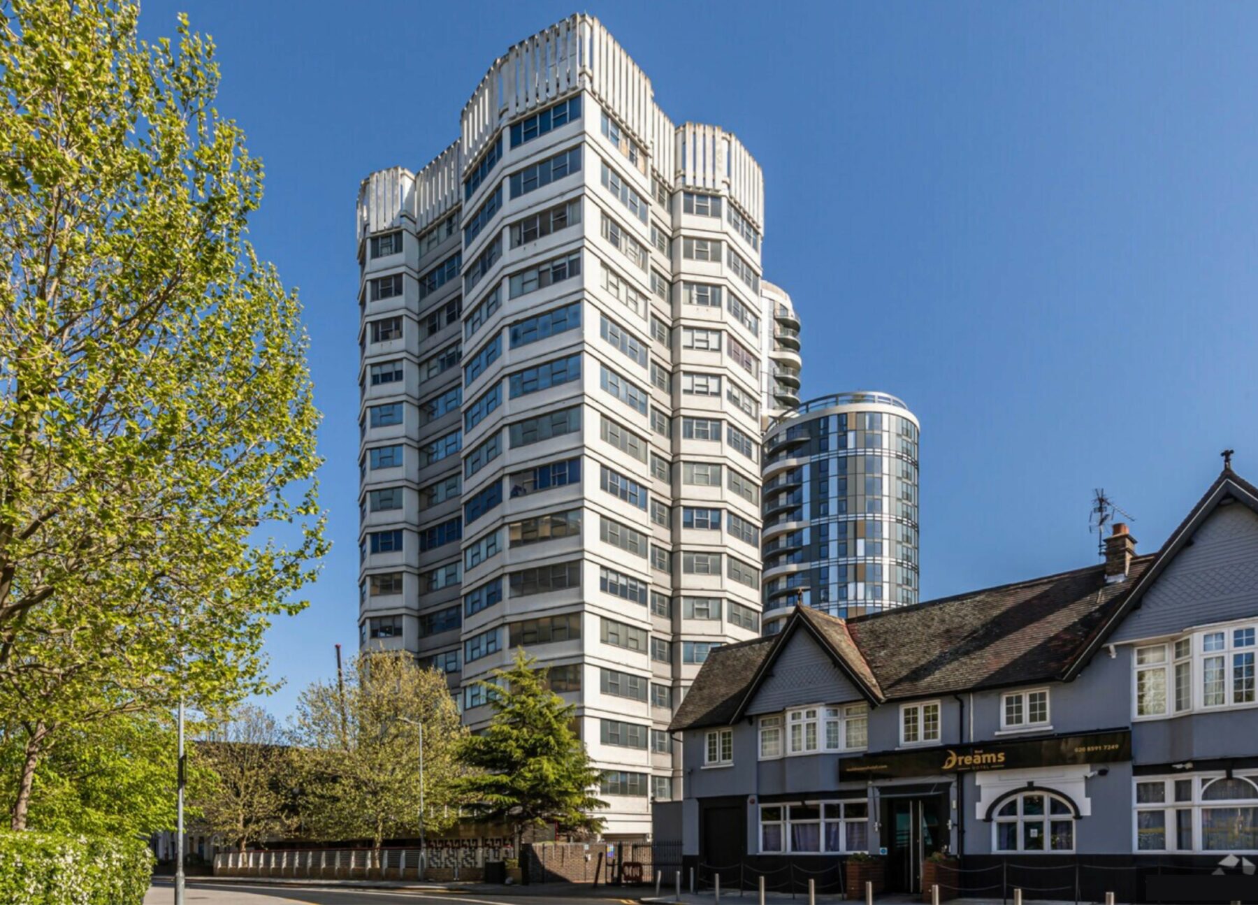
“This is what I am reminded of when I think of postage stamp urbanism. A collection of cakes.” Tess Broekmans, urban planning partner at Urhahn and part-time professor at TU Delft, shows a photo. “They are beautiful and delicious, because they are by Ottolenghi, but they stand side by side like separate pieces of art.” The resemblance is easy to see with a picture next to it from London. It illustrates what happens when thinking only from separate properties. Just a tower next to a century-old property, every development runs to the pavement and there is often a fence there too. “From me, everything really doesn’t have to be designed seamlessly together. But if you want to make city, the structure of in-between spaces is essential.”
Separate developments in London, lacking coherence

A collection of cakes from Ottolenghi
This is exactly what Glenn Lyppens, architect and researcher at Flemish POLO Labs, shows with Nolli’s famous engraving of eighteenth-century Rome. A city map in black and white where the white space represents a large network of urban spaces, even through buildings. “I find it inspiring to see how in that white is always the potential for public accessibility. A palazzo like this might have belonged to a large family, living around the court. Now it is a museum, really public so, soon it will be another office around a courtyard.” The white sometimes turns to grey, then back to white. But because of their main form with addresses linked to the white, these spaces always keep the possibility of being an essential part of the urban structure.
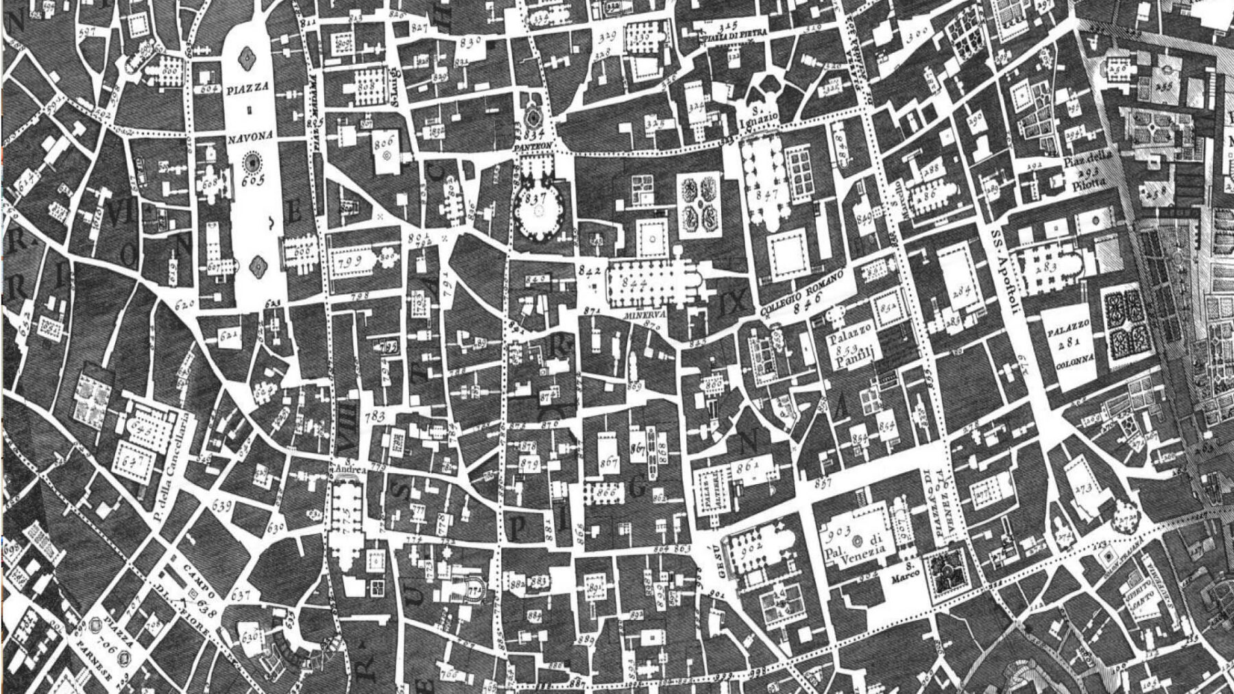
Interspace ≠ residual space
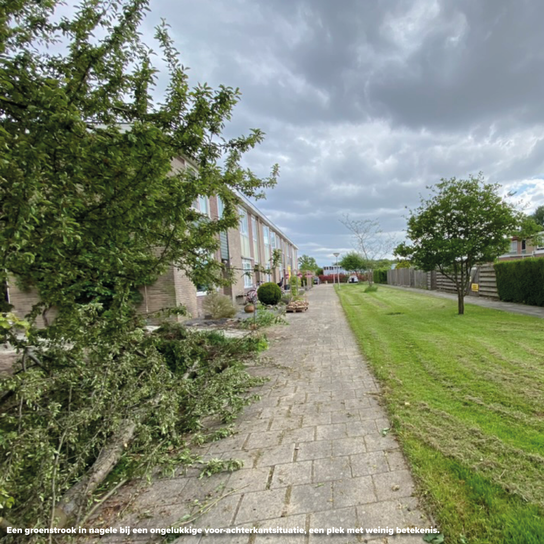
The spaces between public and private, they quickly have a kind of fun factor. Plans feature plenty of neighbourhood parties and barbecues, and every street is full of benches. However, good communal use is anything but self-evident. Machiel van Dorst, professor of Environmental Design at TU Delft, is critical. In the 1960s and 1970s, green spaces were plentiful, but what actually happens there now? “These spaces are often on sides or between unresolved front-to-back situations. If you take a longer look there, they are just fields for the dog.” A semi-public place is extremely vulnerable; if at all possible, it will be privatised. And that is a shame, the speakers agree. Once parceled out, you never get such a space back. Just look at what happened at Sunnyside Gardens in New York. “As designers, we need to make forms that can draw collectivity,” says Glenn, “where it can grow very strongly and in an intimate way. And that are robust enough to serve different purposes and groups in different times.”
“As designers, we need to make forms that can draw collectivity. Where it can grow very strong and in an intimate way. And that are robust enough to serve different purposes and groups in different times.”
Designing robust interspace
Designers can play with size, scale and orientation, the placement of front doors and the location in relation to the street. And, of course, with transitions. How do you enter? Through a large block opening or a small gate? And is there a height difference? For a ‘robust’ in-between space, a certain functional necessity seems to be the common denominator. A place in plain sight that you have to pass by to reach your home or barn. Space you can’t fill up with impunity. It also helps if the expected behaviour is legible at such an intermediate spot, Machiel explains. Are you just going to silently watch in the courtyard, or are you allowed to play football here? A good design can convey that as a matter of course. At the transitions, for that matter, it is allowed to rub off. Someone taking a photo and being looked at strangely, that’s also how contact is established. In the dead-end working-class streets in Ghent, it is not uncommon to be offered a coffee after five minutes.
In addition, functions also strongly colour the character of a place. If there are small businesses or services like a laundrette or specialty shop adjacent to a semi-public space next to residential entrances, it can really make such a place land in the city. The mix of functions is a determining factor and the mixed city a huge opportunity, argues Tess. “Opposite my house is a photography studio. The photographer is always there, even during the day when many people are away, constantly keeping an eye on things. He is the mayor of the street. Just by his presence and ownership, it creates a sense of belonging.”
With historical examples, you can see beautifully how a space functions over the centuries. Look closely, because it is valuable information for future-proof design, Glenn urges. There are always different periods of collective use, by families, by the elderly, by entrepreneurs and different cultures. At the same time, you see that a sense of commonality always comes and goes; in time, a collection of shades of grey dances through Nolli’s white spaces. So there are also periods of transition, when less happens. Let it go, the speakers think. Don’t jump straight into a reflex of demolition-new building if a place looks a bit lost. Such periods are ultimately the cradle of collectivity. Look at squatters, look at problem neighbourhoods. It is precisely when things become a mess that people start organising themselves again.


Predatory construction on the street
Spectacular postage stamp plans, they are beautiful, but they also have a risk. Too dominant semi-public spaces can rob the street. Inside the block is then a beautiful yard full of vibrancy, outside it only the parking spaces and underground containers end up. Tess: “The second level sometimes becomes a surrogate for urban life. And that’s a dangerous development. The street has to be right, that’s the most public place, and we as urban planners are responsible for that.” Perhaps part of the answer already lies in refining the urban fabric. As a municipality, do not give out too large pieces of land, however tempting it may be if the developer promises a beautiful courtyard garden. Keep the city fordable with public space that, although by appropriation, can take on a more collective character. And create in-between spaces with different characters within different ownership situations. Introverted and extroverted, at ground level and above, enclosed and directly on the street, and with public functions and without. Give white space many characters.
“The second level sometimes becomes a surrogate for urban life. And that is a dangerous development. The street has to be right, that’s the most public place, and we as urban planners are responsible for that.”
Nolli and Ottolenghi make the city
Perhaps that is the city that would emerge if Nolli and Ottolenghi were allowed to create its contours together. A sophisticated fabric of urban spaces, with infill with guts within it. Ottolenghi is the king of combining flavours, says Tess: “Real flavours. Using lots of spices, and making a difference with that. It’s exciting and there’s always something new to discover. Ottolenghi would make an excellent urban planner, especially if he also has a say in how everything is connected.
Next podcast
Metropolitan Clubtalk will appear twice more this autumn. On 26 October, Robbert Jan talks to Anne-Loes Nillesen, Errik Buursink and Helmut Thoele about attachment and in-between space at the regional level of the urban landscape. Is the Netherlands now becoming Lower Town?
